Wordpress Part 3
Wordpress Part 3
Let's look at how to manage content in Wordpress in an accessible, SEO-friendly way.
I hope I'm not telling you anything shocking when I say that social media matters in 2022.
The degree to which it matters to you and your content will depend on what you're doing. Running an Etsy shop? Pinterest might be your primary marketing channel. Writing some documentation for your bash profile? Maybe that's something you do for you and your team, and going viral isn't a priority.
Regardless, it's unlikely that you want to get in the way of social media.
If you do want to stay "under the radar", check out the robots meta tag Opens in a new window.
Be careful with these! If you don't do this with your user's experience in mind, it can lead to some awful clutter.
To share links to your social accounts on every page of your Wordpress.com account, you'll need a "social menu".
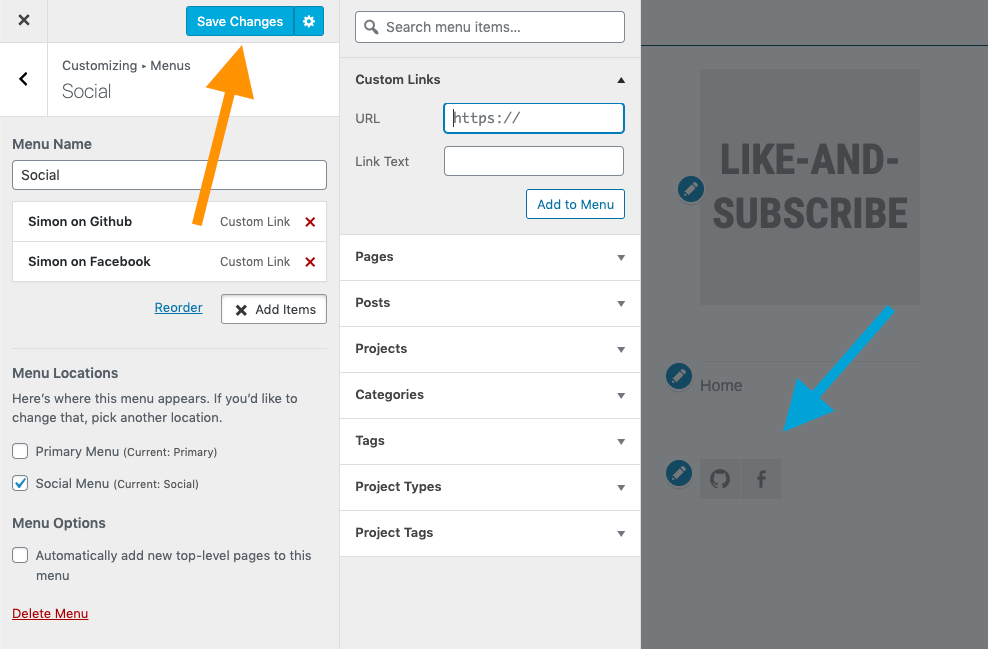
A social menu isn't much different from any other type of menu, except for the fact that it will automatically turn your links into icons. Let's take a look at how to do that.
This process works in themes that have the social menu feature. To check if yours has it, follow the steps we took before when changing themes.
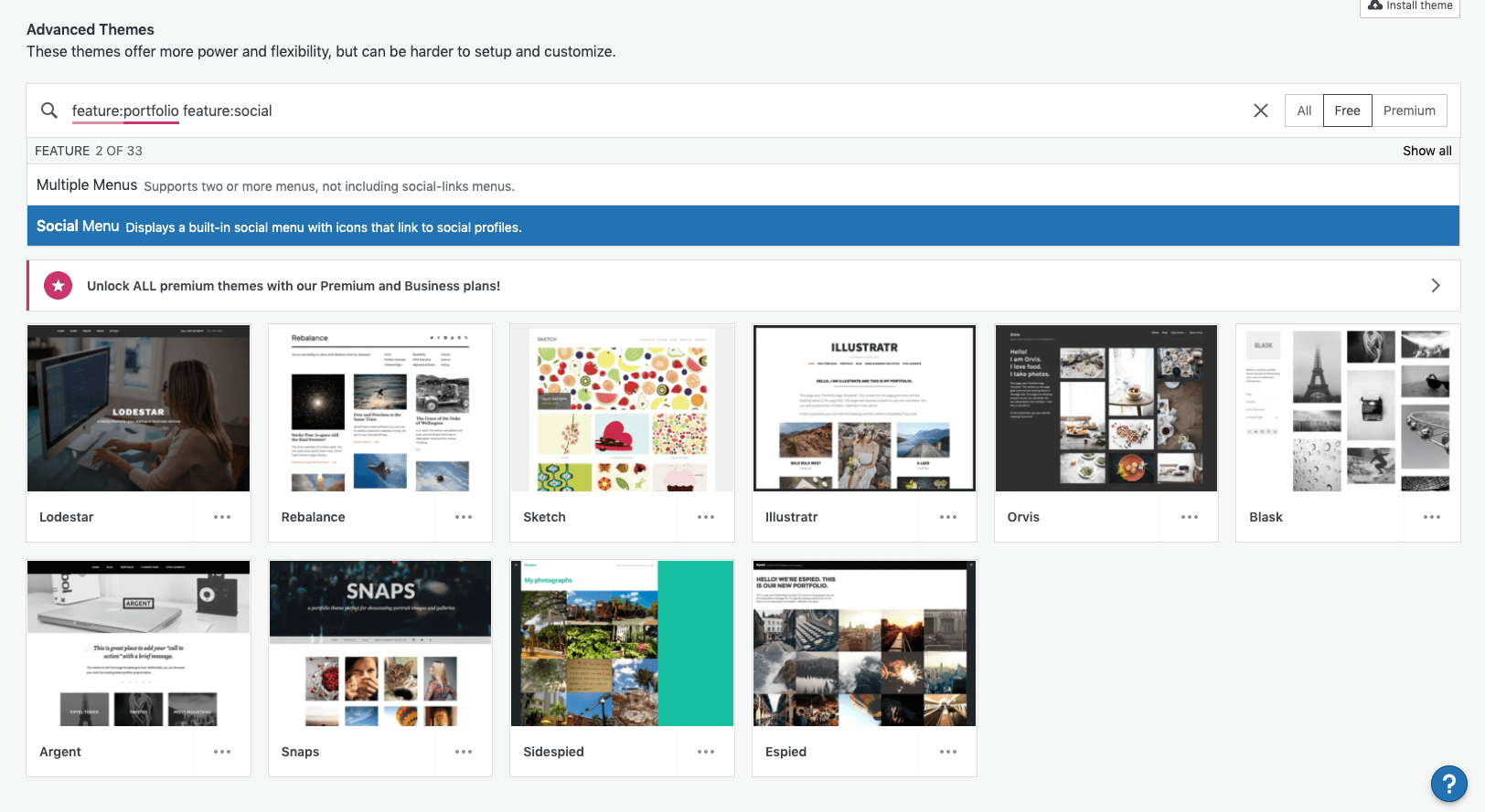
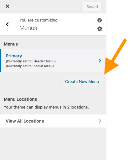
If your theme has a social menu option, you can head to the "Customize" screen to add a social menu. Start by clicking the "Create New Menu" button.
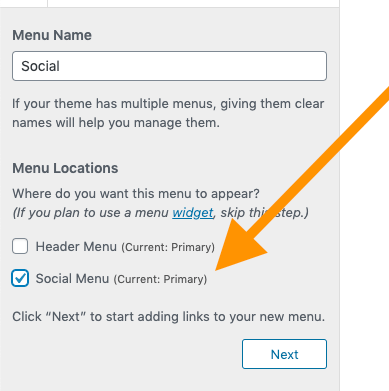
Give your menu a name, and assign it to a location.
Add menu items to your social profiles as 'Custom Links', filling out both the URL and the link text.
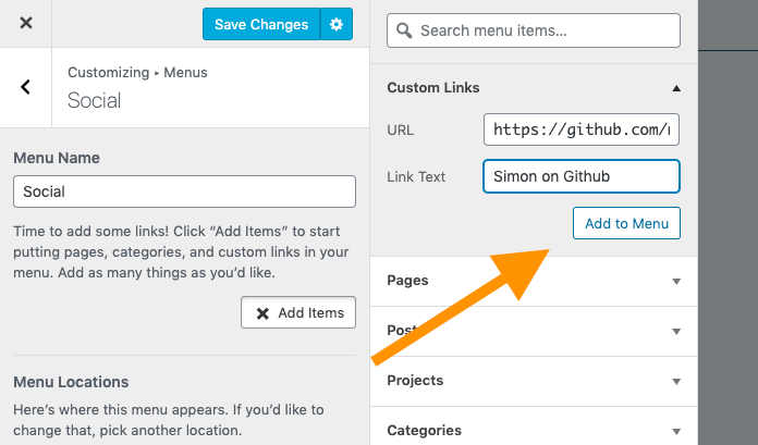
Don't forget to save the changes to your menu - it's easy to navigate away without saving.
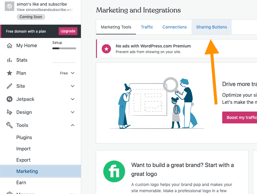
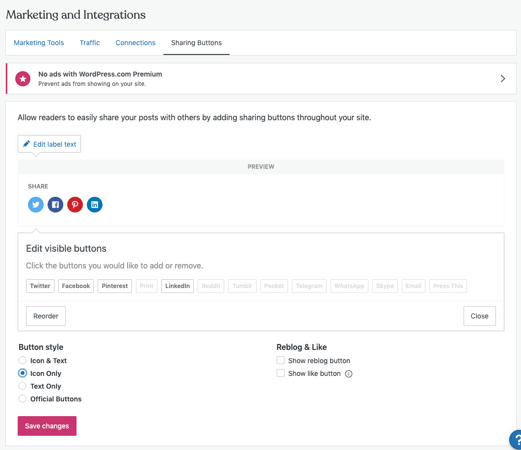
To access these settings, go to Tools > Marketing from the dashboard, and then click on the Sharing Buttons tab on the top.
From here, you can choose the appearance of the buttons...
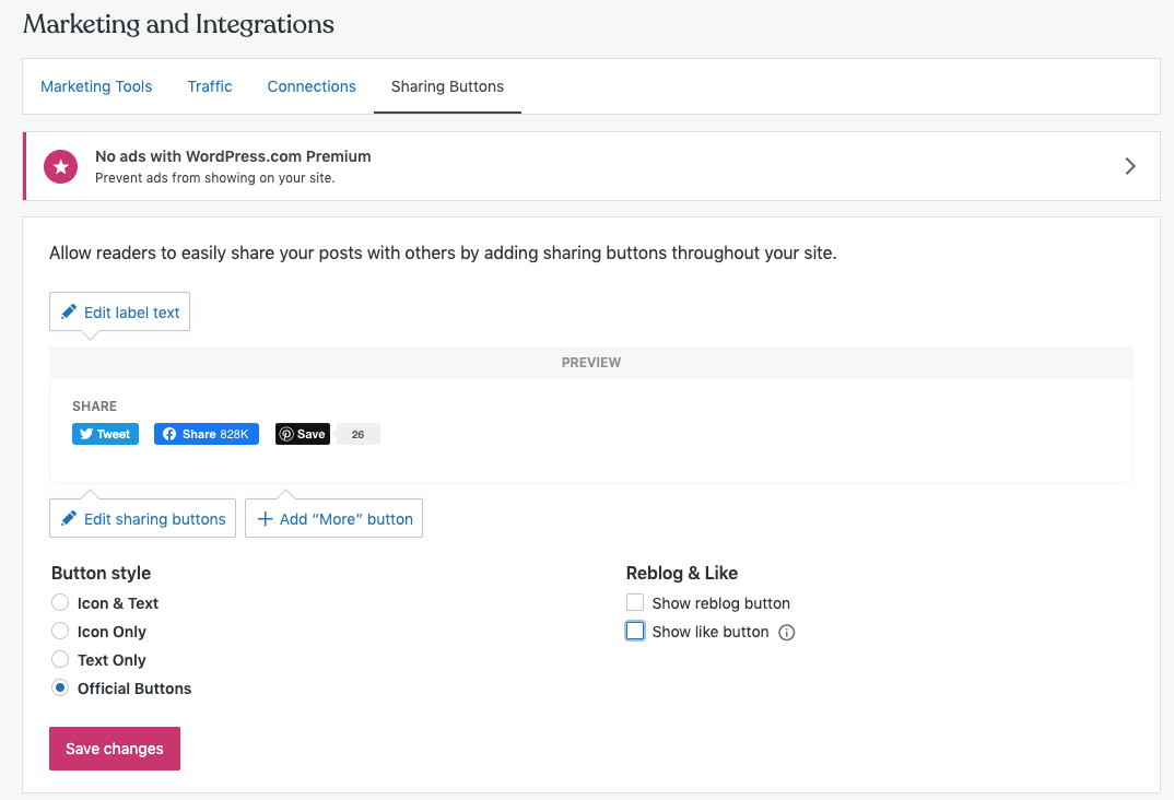
...as well as other options, like which types of pages should have the buttons...
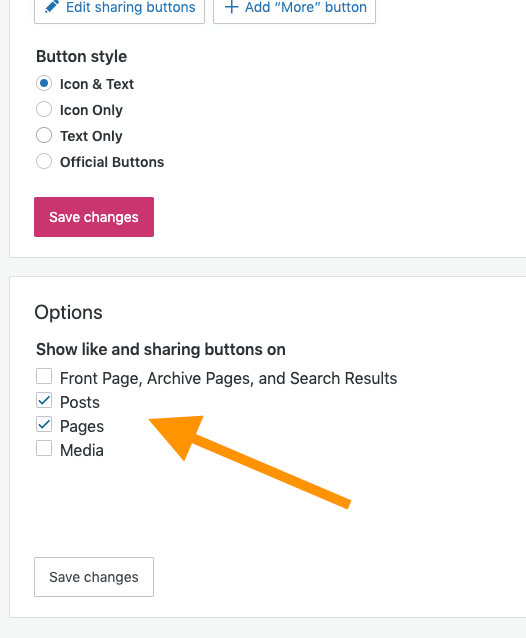
...and finally, and perhaps most importantly, which social media you want included.

SEO‑friendly content
As we know by now, there's two ways people find stuff nowadays - social and search. Now that we've looked at social, let's see what we can do to make ourselves searchable!
Editing slugs
Slugs are the final part of the URL
| Scheme | Host | Path | Slug |
|---|---|---|---|
https:// | en.wikipedia.org | /wiki/ | HTTPS |
Slugs affect your SEO. If you can put one of your key words in your slug, this will help your search rankings for that term.
By default, your slugs in Wordpress get generated automatically, but they are editable.
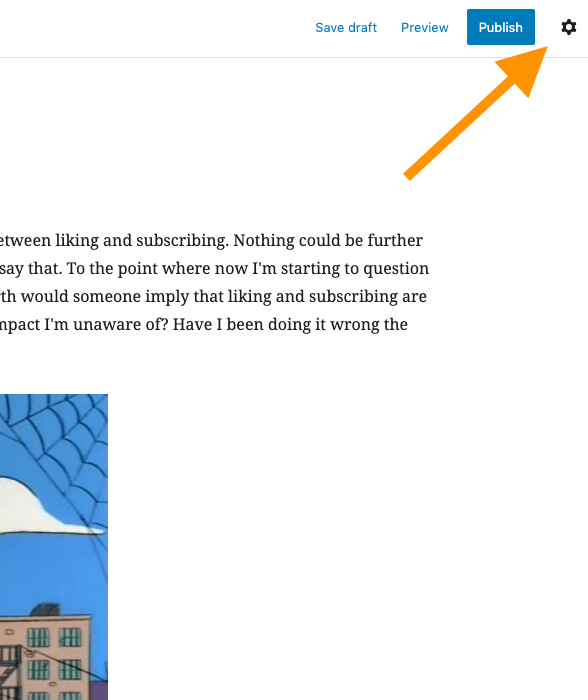
Go to the post for which you want to edit the slug, and click on the "Settings" gear icon in the top right.
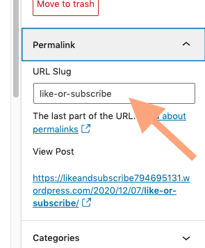
In the settings, under "Permalink", define your own slug. Make sure there are no spaces, or special characters, and that it's all lowercased. Typically, you separate words with a hyphen.
In Wordpress.com, all of your posts will get put in a series of folders for the year, month, and day the post was created. With a self-hosted Wordpress site, you can edit the permalink settings so that your path is determined by something else, for example, a category. This tends to be a better look.
Choosing Keywords
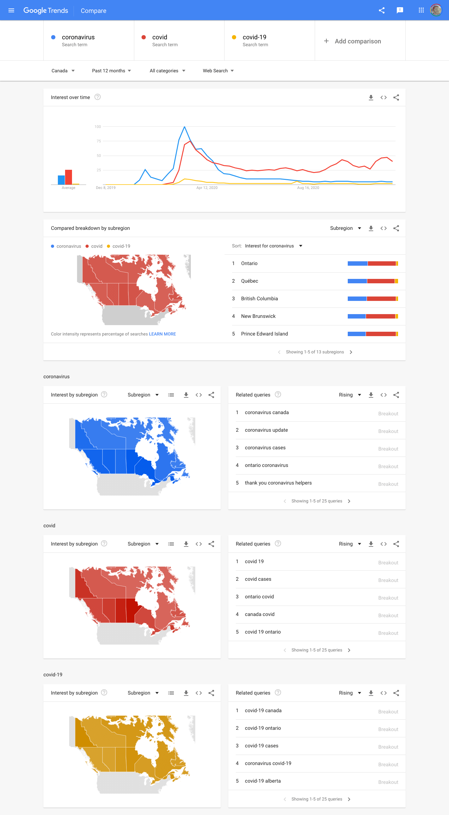
Choosing the right keywords for your content is a specialized skill, but today let's take a quick look at how you can use Google Trends Opens in a new window to inform your decisions when you need to choose one word over another.
You can compare different search terms to see which words people tend to use over others.
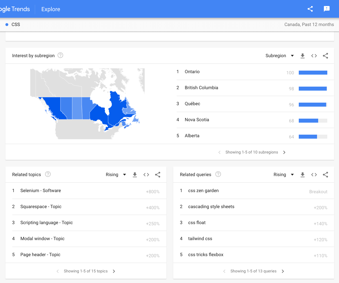
The "related" search terms can be a gold mine to see what people from your area of interest might also be interested in.

Accessibility Checklist
But even if you ignore all SEO and sharing considerations, there's one thing I never want you to forget: accessibility.
Even though we had a lesson on accessibility, let's review, focussing on the things we can affect when we're simply writing content in Wordpress.
The three major accessibility concerns you'll have when creating content for a Wordpress site are 1) alternative text for images, 2) accessible links, and 3) maintaining color contrast.
Alternative text
You probably remember from two weeks ago when we learned to add alternative text to the logo while we uploaded it.
This process applies whenever you upload a new image, but what about adding alternative text to images you've already uploaded, or came with the theme; what about editing existing alternative text?
The process for adding or editing alternative text for images that are already uploaded is the same either way.
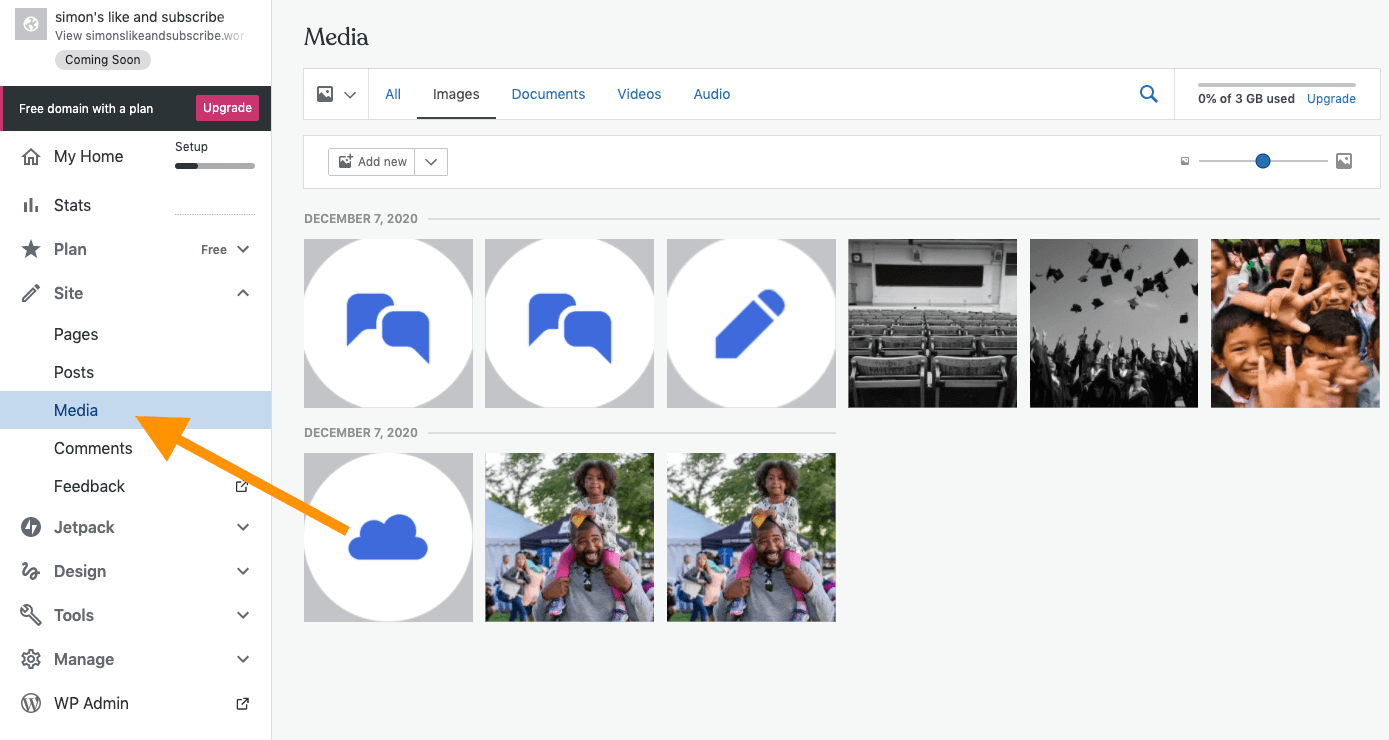
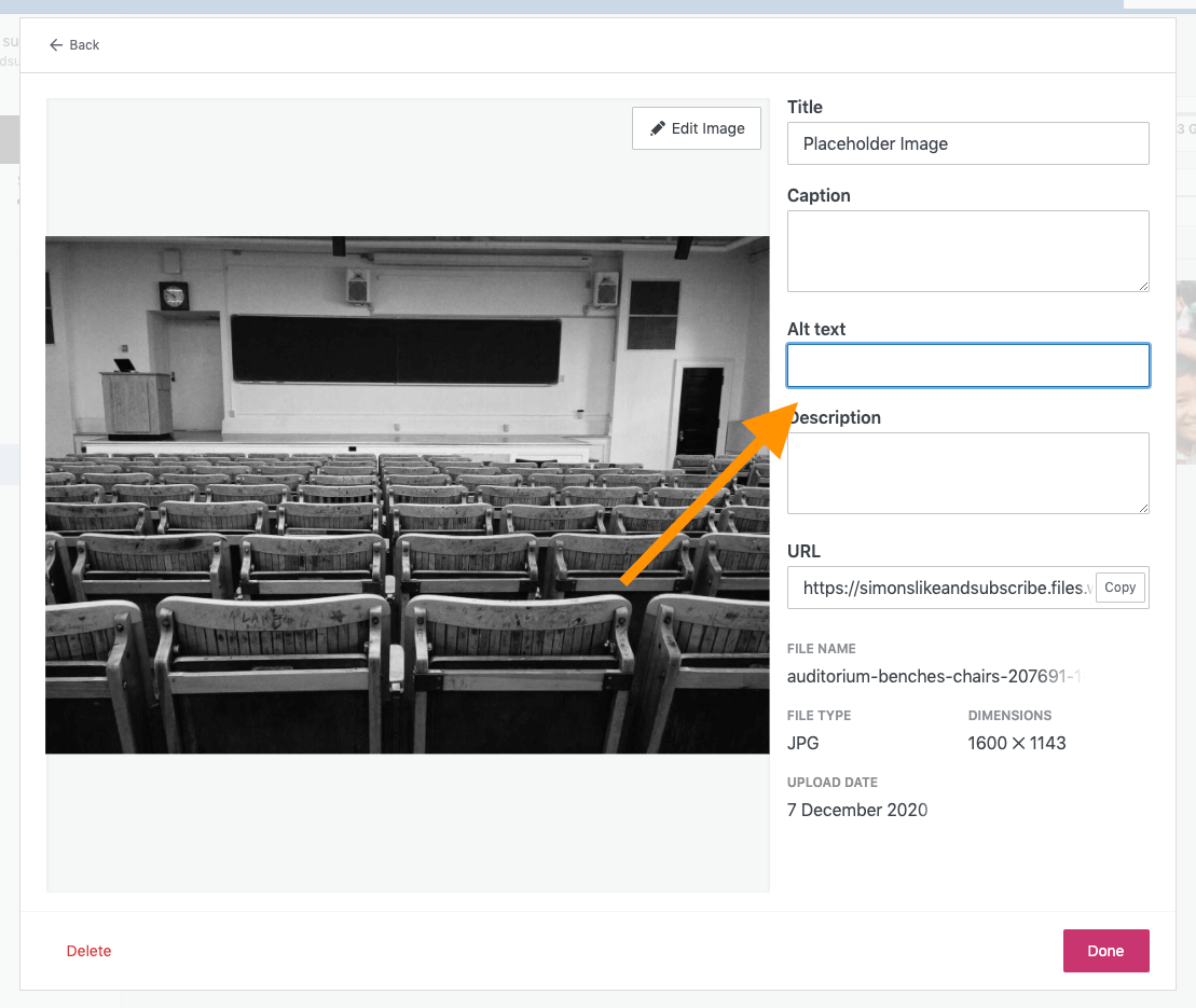
Select the image you want to add your alt text to, and fill in the blank!
Contrast
Hopefully the colour contrast between your text and the background colour of your pages is already established in your theme's CSS.
However, you can override colours when writing posts. And that's fine! Just make sure you're not creating inaccessible content when you do so.
To be (Level AA) accessible, your body text needs a colour contrast ratio of 4.5:1. Your large text (20px+ if bolded, 24px+ otherwise) needs a contrast ratio of 3:1.
Not sure what colour to use? Check with the W3C's Colour Contrast Checker Opens in a new window
Not sure what colour you're using? Get the colour of any element on a page with this browser extension for Chrome or Firefox Opens in a new window.
Want to verify your work? Get the WAVE browser extension Opens in a new window.
Links
There are only a couple of accessibility mistakes you can make with an anchor tag, while still using it semantically.
One mistake I made for years: the text of a link should not be a URL. Many popular screenreaders will not allow the user to skip while it reads the text of a link.
<a href="guesswhat.co.uk">
https://www.guesswhat.co.uk/I/sound/super/
annoying.php?so=don-t&do=this&to=your&user=ok</a><a href="guesswhat.co.uk">We can't put long,
rambling text in our links like we used to,
but we have our ways. One trick is to tell 'em stories
that don't go anywhere - like the time I caught the
ferry over to Shelbyville. I needed a new heel for my
shoe, so, I decided to go to Morganville, which is
what they called Shelbyville in those days. So I tied
an onion to my belt, which was the style at the time.
Now, to take the ferry cost a nickel, and in those
days, nickels had pictures of bumblebees on 'em. Give
me five bees for a quarter, you'd say. Now where were
we? Oh yeah: the important thing was I had an onion on
my belt, which was the style at the time. They didn't
have white onions because of the war. The only thing
you could get was those big yellow ones...</a>Another thing to keep in mind is that links are an in-page navigational tool. When using the keyboard to navigate a page, the user can hit the tab button to go to each interactive element in sequence. This means that if the context for a link comes before that link, people using screenreaders will have not context for that link. Stuff like this is really unhelpful:
<a href="/somewhere-else">Read more</a>That being said, just like with images, screenreaders will inform the user that what they're focussed on is a link, so it's redundant to tell them:
<a href="https://en.wikipedia.org/wiki/Redundancy">
Link to Read More about Redundancy</a>
You have to let people know what the link does.
Shifting a user into a new window or tab can be disorienting if you don't give them a heads-up.
<a
href="https://en.wikipedia.org/wiki/Tab_(interface)"
target="_blank">Read about Tabs on Wikipedia
<span style="font-size: 0"> Opens in a new tab</span>
</a>As we just discussed, text needs a certain contrast ratio compared to the background colour. If you don't underline links, they need a strong contrast ratio compared to the background colour and the non-link text. This leaves you with very few options for making accessible links that don't have an underline.
The simple solution: underline your links.
If you hate the default underline for links, you're welcome to use the border-bottom CSS attribute instead - it works just as well!
// Links must be recognizable
<a style="text-decoration:none;border-bottom:2px solid;">
I need a non-colour visual indicator</a>// But I want my image to be linked!
<a href="/image-destination">
<img src="this-totally-works.jpg"
alt="The user will be read the alt text
as the link text!" />
</a>
Social Media and Wordpress