Design & Development Workflow
Design & Development Workflow
Today we learn about the lifecycle of a web-based project. We'll look at all the possible stages of a project, whether big or small.
For each stage of the workflow, we'll look at the disciplines involved. For a large team, these might be different people with different titles.
On a smaller team, they might be different "hats" worn by the same person (a common term when one person takes on multiple responsibilities).
We'll also look at the tools commonly used in the industry, techniques for getting the best results, and what deliverables (generated materials) are involved for each stage.
These stages aren't always performed in this order! Research, for example, can happen as a result of analytics (once the users are using the product), requirements can be generated as part of the QA process, and all these steps may just be one cycle in a larger project.

Market research
- Product Owner
- UX Researcher
- Market analysis
- Analytics
- User surveys
- Research report
- Personas
Typically, market research is done by the Product Owner, not someone on the design and development team. However, if the team has done similar work for the client, they often have insights, through analytics and user outreach, that can be invaluable during this stage.
The purpose of this stage is to understand who your audience is, how it can be segmented (broken down into user types), and what value you can offer.
There are a number of strategies for creating tools based on your audience. Probably the most popular is the 'persona'.
Personas
Personas are a tool for creating a design. A persona is a fake person you use to represent a major user group for your product.
Let's say you're a library, and you're creating a form to get people to sign up for an online account. You would create personas based on your current users, and any group that you want to target as a user (maybe you've got an ad campaign to drive new users to the website, for example).
Based on the information you have, you might create personas for an elderly person, a parent with children, and a student.
Personas generally include the following key pieces of information:
- Persona Group (i.e. web manager)
- Fictional name
- Job titles and major responsibilities
- Demographics such as age, education, ethnicity, and family status
- The goals and tasks they are trying to complete using the site
- Their physical, social, and technological environment
- A quote that sums up what matters most to the persona as it relates to your site
- Casual pictures representing that user group
The purpose of making up a fake person, rather than simply pointing to your analytics data, is to facilitate design discussions (particularly with people who don't deal with analytics on the regular).
Further Reading:
- Discovery on a budget Opens in a new window, A List Apart
- Google Analytics for Beginners Opens in a new window, Google
- Personas Opens in a new window, Usability.gov

Ideation
The ideation phase is when you have ideas!
If you're coming up with an idea from scratch, whether building your own app, or just proposing some strategies to a client, this is your chance to brainstorm all kinds of wild ideas - or maybe just turn your client's goals into a strategy.
- Brainstorming
- Whiteboarding
- Client Meetings
- Product Owner (usually the client, or someone representing them)
- a Scrum Master (to determine the team's capacity),
- a Content Lead,
- a Design Lead, and
- a Development Lead,
Brainstorming
Brainstorming is when you generate lots of ideas - quantity over quality!
Brainstorming sessions are not the time for criticism. There's time for that later. This is the "no bad ideas" part.
Brainstorming should always be "time-boxed". If there are no bad ideas, then generally people can keep throwing out uncritical nonsense until the caffeine wears off.
There are a number of wonderful techniques for running brainstorming sessions (see "Further Reading"), but this can be as simple as writing down ideas on a whiteboard.
Turning goals into strategies
If you're working for a client, they might already have firm ideas about what they want. Depending on the circumstances, and your relationship with the client, it might be a good idea to review their goals. Is what they're asking for the best way to get what they want?
Remember that you are an expert in your medium - you might be aware of opportunities they don't know are available!
Further Reading:
- Conducting Brainstorming Workshops Opens in a new window, Smashing Magazine
- I Don't Like It Opens in a new window, A List Apart

Requirements / Timeline
- Product Owner
- Project Manager/Scrum Master
- a Content Lead,
- a Design Lead, and
- a Development Lead,
- Meetings (sometimes lots of meetings)
- Project management software (JIRA, Asana, Trello, etc.)
- Project timeline
- Feature breakdown
At this point, you should know your strategy for achieving your goals with your users. This is the point at which you decide what is necessary for achieving those goals, break down those necessities into "features" (parts of the whole that can be worked on separately), and then a timeline is agreed upon.
This is your first line of defence against "scope creep" (the tendency for people to ask for more than what was agreed upon). Clarity at this stage on what is "in scope" (working that is being taken on) and "out of scope" (work that is not being taken on) is very important to maintaining good relationships and delivering on schedule.
Further Reading:
- Requirements Gathering: A Step By Step Approach For A Better User Experience Opens in a new window, Usability Geek
- What Really Matters: Focusing on Top Tasks Opens in a new window, A List Apart
- How to create a project timeline in 7 simple steps Opens in a new window, Asana

Content
- Content team
- Design team
- Copywriting
- Content library (for aligning new work with existing guidelines)
- Google Trends (for generating SEO-optimized copy)
- GatherContent (for staying organized)
- Design
- Style guide (for aligning new work with existing guidelines)
- Photoshop (for creating/manipulating images)
- InDesign (for creating/manipulating vector graphics)
- Figma (for creating an asset library for the project)
- Copy deck
- Image files
The content stage might be done before, after, or in parallel with the Visual/Interaction Design stage.
In this stage, the team generates images (both pictures and graphics), and copy (the words that go on the page).
Both of these processes are usually guided by style guides - established patterns for creating content that will be "on brand" for the client.
Other consideration include the project goals and requirements, and optimizing SEO by choosing words (and, increasingly, images) that will rank highly in search.
Further Reading:
- How the Sausage Gets Made: The Hidden Work of Content Opens in a new window, A List Apart
- Copywriting Vs. SEO Writing: What’s the Difference? Opens in a new window, Campaign Monitor
- Quick Course On Effective Website Copywriting Opens in a new window, Smashing Magazine
- SEO copywriting: The ultimate guide Opens in a new window, Yoast

Design
- Web Designer
- User Experience Designer
- Interaction Designer
- ... and other sub-disciplines of design
- Balsamiq (free, for beginners)
- Figma
- Sketch
- Adobe XD
- InVision
- Style guide
- User journey map
- Wireframes
- Prototype
The design phase of a project can look very different from project to project, and from team to team.
Those responsible for this phase could be...
- a graphic designer (who knows a little code),
- a developer (who knows a little about visual design),
...or it could involve different specialists who focus on things like...
- User Experience (how users feel about the experience of using the application),
- Customer Experience (how users feel about the web site owner while using the application)
- Interaction Design (how things behave when you interact with them)
- etc., etc.
Depending on what is being designed, this process could take months, a day or two, or it could be overseen by an automated process, without any human involvement!
If the project is starting from scratch, this process will include generating a style guide.
If the project will allow the user to do something they couldn't do before, this process will include mapping the user journey.
If the project will generate new page templates (i.e. you can't just take an existing page layout and put the content in), this process will include wireframes & mockups.
Style guide
A style guide is the documentation that serves as the "source of truth" (i.e. the winner if something conflicts with it) for all other design and development work.
It documents styles and when to use them.
The most basic style guide would document colours, plus their meaning.
For example:
| Swatch | Hex | Name | Purpose |
|---|---|---|---|
| #191919 | Cod Gray | Text | |
| #F4F3F1 | Cararra | Background | |
| #DB2522 | Alizarin Crimson | Alerts | |
| #EF8F24 | Carrot Orange | Warnings | |
| #309B76 | Lochinvar | Confirmations |
Basic style guides typically include:
- Colours
- Fonts
- Heading sizes
- Styles for small components, like buttons
- Common design patterns, like menus
A full style guide should include headers, footers, page layouts, forms... basically everything a designer might need, including responsive designs and variations for different types of content.
A style guide should be "living", meaning that it can be amended and added to whenever necessary.
A good style guide should minimize client approvals, since styles in the style guide should be "pre-approved".
A good style guide should also minimize development time. If all the elements are built already, developers should be able to simply include a templated component or add a class. Better yet, a content editor can simply add the elements through a CMS.
User journeys
If the project is adding a new user capability, this should be mapped out in a User Journey map. (If this is a whole new project, then a User Journey map should be created for each goal a different set of users might have.)
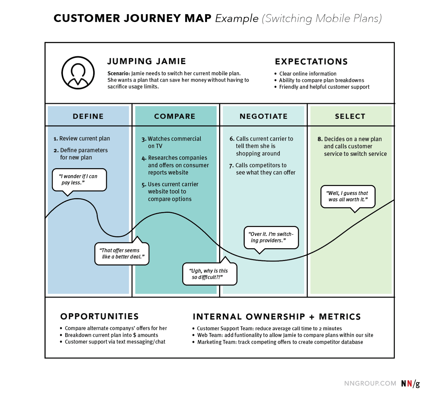
Websites have different types of users with different goals. Every website has at least one page that is trying to be useful to more than one type of user.
Creating user journey maps (following one user type through one goal) should be referenced while creating wireframes, so that different journeys don't conflict, and the right goals are given the right priority.
Think of the homepage of a library's website. One goal is to login and renew books. Another goal is to check the library's hours. If I visit www.local-library.com, and the site immediately opens a full-page login pop-up, that may be a bad experience for me - I'm just trying to check the hours!
Wireframes, wireflows, mockups & prototypes
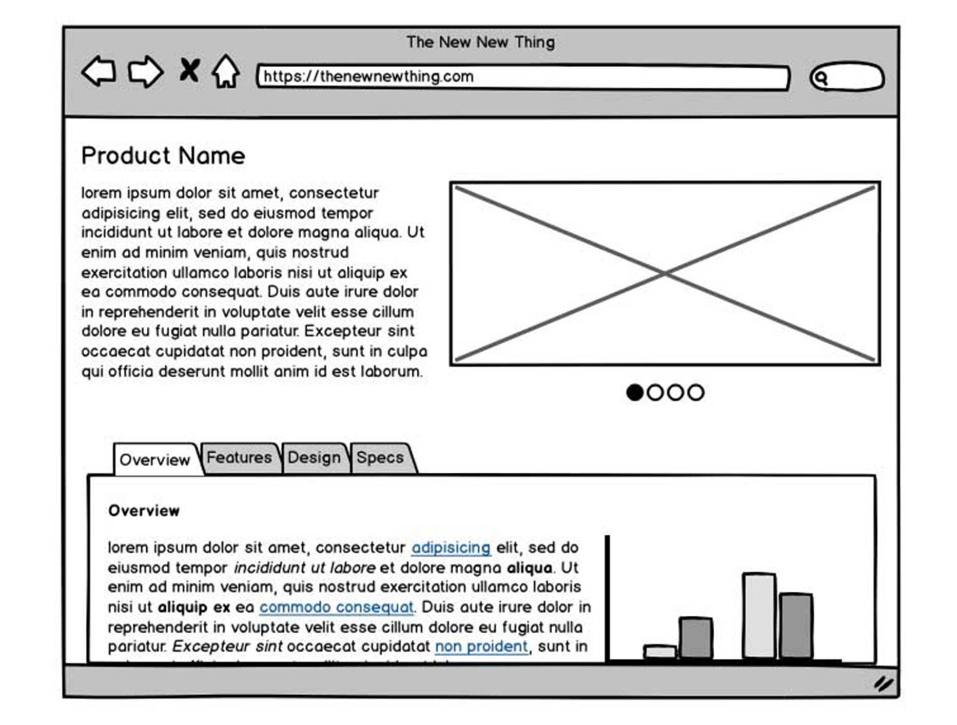
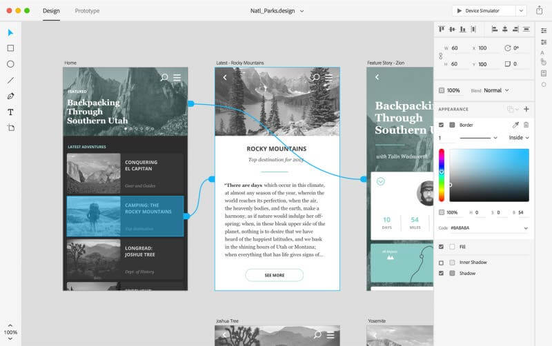
Wireframes are "sketches" of the website layout.
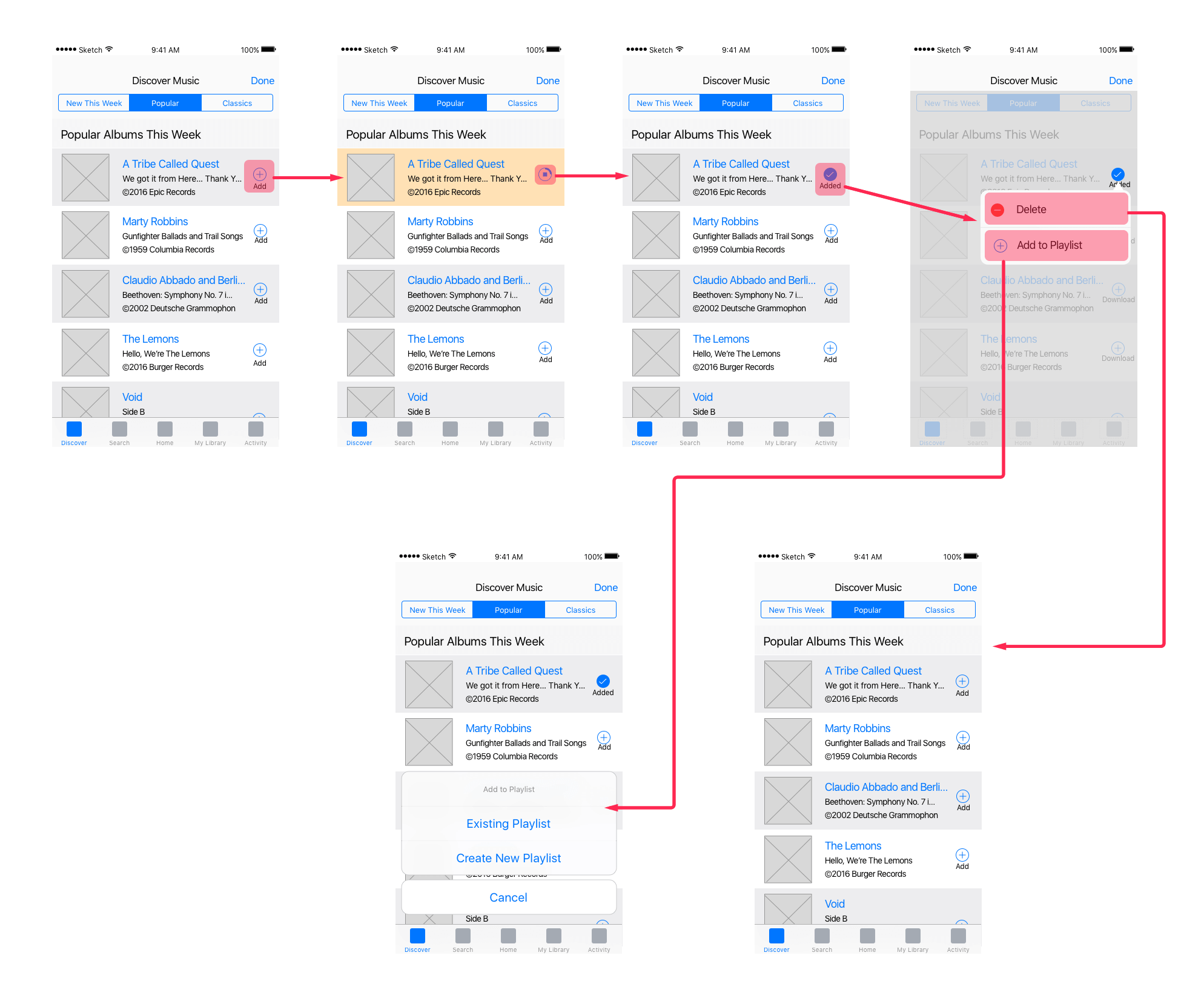
Wireflows are compilations of wireframes that show the user journey.
Mockups are high resolution renderings of what the application will look like.
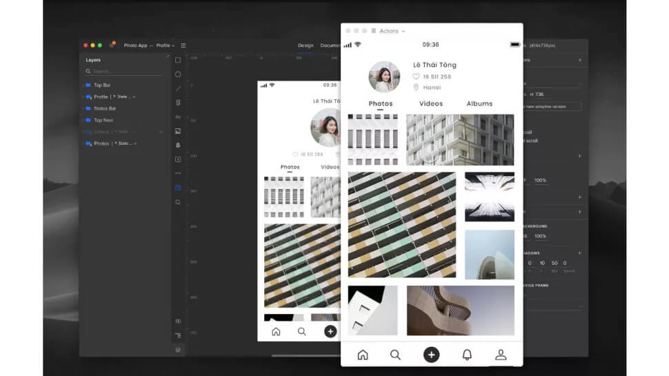
Prototypes can be quick-and-dirty coded versions of the feature, or interactive mockups that include animations and the user journey.
Design conventions
Sometimes the person tasked with the web design phase finds themselves without a proper style guide, appropriate existing layouts, or explicit layout requirements.
Non-traditional, experimental design can be wonderful, exciting, and rewarding. However, you also have to contend with deadlines, client expectations, and users who just want to find out what time the library closes, goshdarnit.
It's at this point that a web designer asks - what is the normal thing to do?
As a rule, users are best served by designs and layouts that are intuitive - meaning that they can easily recognize interactive elements, and where to find the information they're looking for.
Most of these conventions are not just tried-and-true, they're based on a simple principle: people scan site content in a particular order.

People will scan your website starting in the corner where they would start reading a page of text. They continue scanning from the initial side, going less and less far across the page the further down they go. This is know as the 'F-Pattern'.
Remember that not all people read from left to right! Readers of Arabic, Hebrew, Pashto, Persian, Urdu, and Sindhi read horizontally right to left, and readers of Chinese, Japanese and Korean scripts read vertically from right to left. Know your audience.
Web design no-brainers
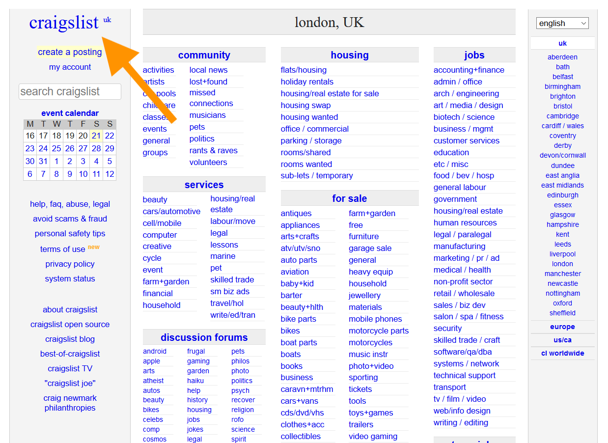
- Put the logo in the top left, and make it a link to the home page.
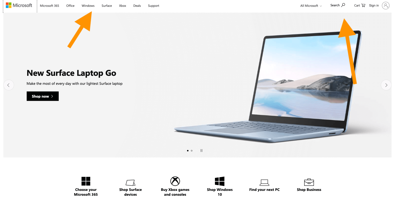
- Put the navigation prominently in the header.
- Put important actions in the top right.
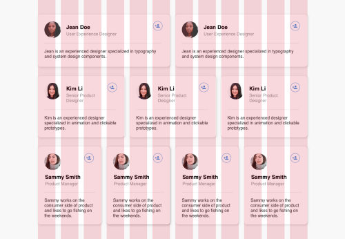
- Stick to the grid. Using a grid to guide your content placement creates a consistent, predicatable experience.
Prioritize content in highly read areas. One guide for this could be the F-pattern we discussed earlier. Another high-priority pattern is choosing what content should be "above the fold".
This is a term that dates back to newprint - top headlines were kept in the top half of the page, above where the newspaper would be folded in half horizontally. In the early days of the web, people did not scroll web pages. Like, at all, basically.
This has changed somewhat.
In 2010, 80% of the viewing time was spent above the fold. Today, that number is only 57%.
Add to that the fact that responsive design means there is no exact spot where the "fold" will be for users. Nonetheless, it's a good rule to follow that the higher up the content is, the better the chance users will actually see it.
In 2010, 80% of the viewing time was spent above the fold. Today, that number is only 57%.
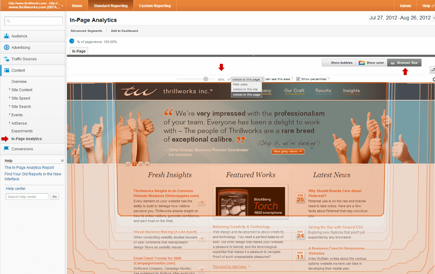
- Boring stuff goes in the footer. Sitemaps, contact forms, social media links, copyright - all the stuff the client requires but no user would ever actually need.
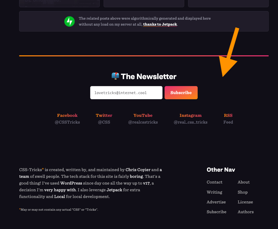
Those are the big ones! Web design truisms that you can hang your hat on. Of course, there are all kinds of smaller conventions that we can take for granted (☰ hamburger menu, anyone?), but these 6 standard approaches to page design are enough to get you started.
- 239 style guides including Apple, IBM, and Starbucks. Opens in a new window, Styleguides.io
- Journey Mapping 101 Opens in a new window, Norman Nielsen Group
- Everything You Need To Know About Wireframes And Prototypes Opens in a new window, Adobe
- Visual Hierarchy: Organizing content to follow natural eye movement patterns Opens in a new window, Interaction Design Foundation
- F-Shaped Pattern of Reading on the Web: Misunderstood, But Still Relevant (Even on Mobile) Opens in a new window, Norman Nielsen Group
- Building Better UI Designs With Layout Grids Opens in a new window, Smashing Magazine
- Scrolling and Attention Opens in a new window, Norman Nielsen Group
- Responsive Web Above The Fold Opens in a new window, CSS Tricks

Development
- Developer
- Code editor
- Code audits
- Code review
- Version control
- The application itself
- Pages
- Features
- Internal tools
Once all the content, requirements and designs have been delivered, the process of turning designs into working code can be pretty simple.
In the practice, this tends to be a stage where "the rubber meets the road" - ideas may turn out to be more challenging to implement than assumed, and important things may have been simply forgotten. There tends to be a lot of spirited back-and-forth at this stage.
Depending on the project and the team, there may be a significant codebase to work with, meaning two things:
- A lot of your work may be done for you, and
- You have to be familiar with the codebase in order to avoid duplicating work.
The developer is also responsible for being familiar with a bevy of technical requirements (accessibility, performance, etc.) that may not have been accounted for in the design process.
Luckily, if anything gets left out, there are numerous opportunities to catch mistakes and omissions through automated and manual testing - provided those processes are set up and enforced properly.
Unit testing
Without getting into the weeds, unit testing is the process of making your code do a bunch of stuff to make sure it behaves the way you think it will.
This is most common with programming languages (like javaScript, and as opposed to markup languages like HTML), where your code will accept inputs and return outputs. A typical unit test will see if your code produces the right outputs for the corresponding inputs.
Your team may already have a library of unit tests, or you may need to write your own custom tests, depending on what you are building.
Code review
Code review is a common practice where another member of your team double-checks your code before it is allowed to co-mingle with the rest of the codebase.
Version control
Version control is a type of tool that allows lots of developers to work on the same codebase, while building different (potentially conflicting) features at the same time.
In its simplest form, version control lets you create a copy of the main codebase on your machine, and "branch" off from the main version (even creating remote backups of your code), until you're done working on your feature, at which point it can be merged back into the main codebase.
There can be many levels of branching, and there may be requirements you have to meet before merging, including automated testing and manual code review.
- How to Start Unit Testing Your JavaScript Code Opens in a new window, Free Code Camp
- How to do a code review Opens in a new window, Google Engineering
- Resources to learn Git Opens in a new window, Github

QA
- Quality Assurance Tester
- Automated browser testing
- Visual diffs
- Manual testing
- Test documentation
As a developer, QA testers have both saved my job, and nearly drove me quit.
QA testers employ a number of techniques, both automated and manual, to make sure that features meet both project requirements and technical requirements. And that the developer didn't break anything.
QA testers frequently employ "headless browsers" - browsers that run in the background, are programmed to simulate a user, and report back on whether links went to the right URL, buttons performed the correct actions, and images loaded properly.
They may also use "visual regression testing", capturing screenshots of a web page before and after a new feature is added, to see if there were any unexpected consequences.
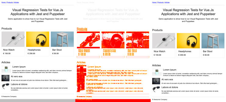
QA testing often involves testing on multiple device types and browsers, either real or simulated.
QA testers have to be the "designated drivers" of the process: unphased by deadlines; unafraid to make a grown man cry; thoroughly versed in, and commited to all requirements, like a lawyer in a John Grisham novel.
 Opens in a new window
- Testing Made Easier Via Framework Minimalism And Software Architecture Opens in a new window, Smashing Magazine

Client Acceptance
- Product owner
- Project manager
- Begging
- Pleading
- Crying
- Changes
- Lots of changes
After you've made your glorious... thing, it's time to remind the client that this is, in fact, exactly what they asked for.
Very rarely are they entirely happy about it.
If you're lucky, you've got a project manager who's willing, on occasion, to tell the client that they can make changes, just not today.
The team's asleep. Please don't make me wake them. They look so peaceful.
- In Defense of Difficult Clients Opens in a new window, A List Apart

Deployment
- DevOps
- Docker
- Kubernetes
- Jenkins
- Amazon Web Services
- Web hook automation
- And so many more - DevOps is all about getting different tools working together.
- Automated processes.
- The code, publicly.
Deployment can be as simple a process as dropping a file into a folder, and checking it in your browser afterwards.
Most website hosting works in this file-and-folder system.
For static sites (like this one!) where there is no database attached, services like Github Pages and Netlify will build from a git branch.
But all that simplicity comes with risks not many medium-to-large organizations are willing to take. Enter the role of devOps.
Reddit user Seref15 describes the role of devOps thusly:
Developers create new bugs and I make sure they are delivered to our infrastructure in an extremely timely and non-interruptive fashion.
The role of devOps (short for "development" and "operations") is to deploy code quickly and safely.
In practice, it means creating a pipeline of different services in an automated workflow from version control (automatically starting a deployment on changes to the master branch, for example), to different testing types (like integration tests, which make sure that everything continues working after it's all been put together), to staging (putting the code in different environments for other testing types, including client acceptance), to backups, to containerization (running light-weight virtual environments), to monitoring the application in the wild.
If I'm being honest, DevOps is a jungle. It's also the fastest legal way I know of getting to a six-figure salary.
- DevOps Cheat Sheet Opens in a new window, Haim Cohen

Analytics/User testing
- Digital analyst
- Analytics software
- A/B testing software
- Analytics report & analysis
Once your site is out in the wild, you can start spying on your users tracking visitors.
Depending on how they're configured, analytics can tell you:
- how many people visit your website
- where they live
- what websites send traffic to your website
- what marketing tactics drive the most traffic to you
- which pages are most popular
- who clicks on what
- where visitors went afterwards
- how long people spent doing different tasks
...and oh so much more.
Other types of user testing can be performed on real-world users as well. A/B testing lets you serve different versions of a page or component to users to see how they react.
This research is put towards refining the things you build, giving you real evidence of what works (and what doesn't).
It's also more data to feed into the gaping maw of the CRM, but that's a different topic entirely.
- The Complete Guide to A/B Testing: Expert Tips from Google, HubSpot and More Opens in a new window, Shopify
- Google Analytics for Beginners Opens in a new window, Google Analytics

Iteration
- Everyone
- Everything
- The same thing, only different
Here's today's exercise:
- Choose a website you enjoy using.
- In writing, define two possible user types for this website, and their different goals while using the website.
What is a user type?
A user type is a group of users who have a shared interest in using your website. Different user types will have different interests and goals.
What is a goal?
A goal is a distinct outcome while using your website, like signing up for a class, or renewing a library book. - Describe the individual steps (clicks, navigation, form fields, etc.) that they would have to take to achieve (one of) their goals.
- Does anything occur to you that could make things easier for them, that is achievable by the website's team? What is it? Or, if you can't think of anything, what designs or features are already in place that make those goals easy to achieve?


