CSS Layout Part 1
This week we'll learn about mobile-first design techniques & media queries; how HTML flows by default, positioning in CSS, and the float property.
Table of Contents

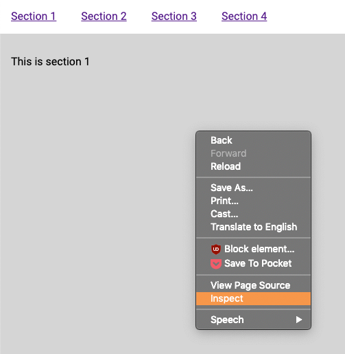
Remember Dev Tools from last week?
Open up the page you built for last week's exercise.
Right-click anywhere on the page, and choose "inspect".
What's that? You didn't save last week's work?
Ah, don't worry, I've got you.
You'll have a window pop up. These are your "browser tools", also known as the "dev tools".
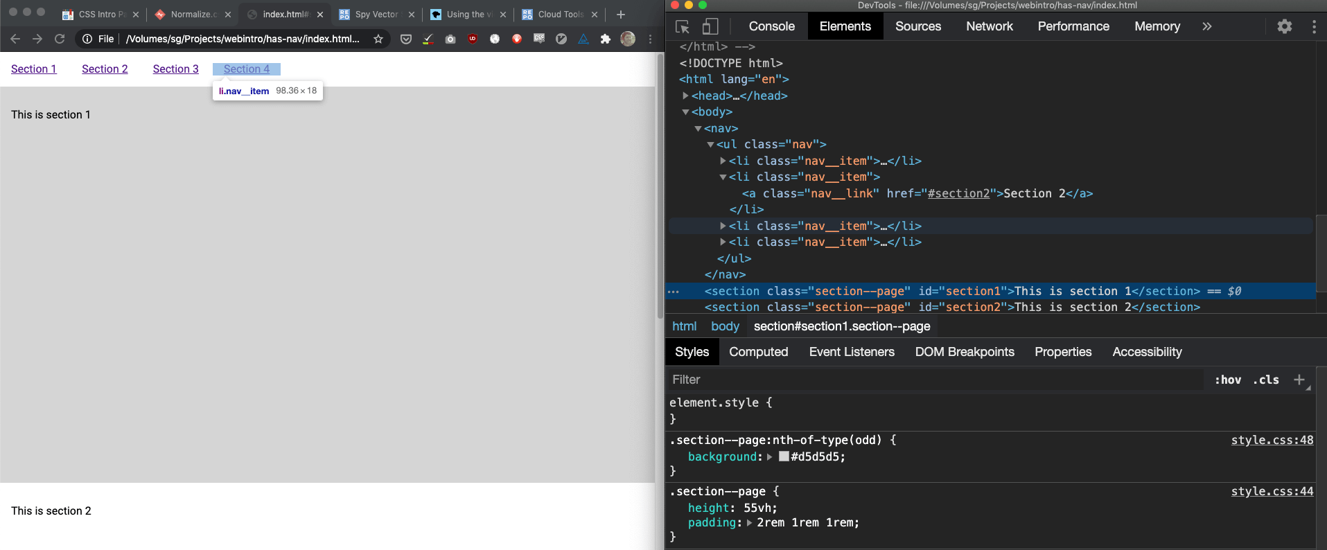
Dev tools mobile emulator
There's a ton of tools in the dev tools, but I just want to show you one today. There's button in the top-left (top-right if you're in Firefox) of the dev tools that kinda looks like a phone and a tablet.
If you click on that button, you can your site rendered in a kind of a mock-up of different devices.
Do this now, and choose 'iPhone X' from the dropdown.
Your page looks kinda weird and tiny, doesn't it?
The viewport meta tag

Remember three weeks ago when I said there were a bunch of different meta tags, and you were like, "Oh man, I can't wait until we learn about more meta tags!"
Well, the wait is over. I'd like to introduce you to a meta tag that you should put in all your html documents:
<meta name="viewport" content="width=device-width, initial-scale=1">There's an in-depth explanation Opens in a new window for why this meta tag is necessary, but essentially what it does is tell the browser "I've built this page so that it works with different screen sizes".
- I suggest you add the viewport meta tag to your html file. Put it in the head before the stylesheets.

Mobile-first
You may have heard of 'responsive' websites. That just means that our content works well at all screen sizes - growing or shrinking content, and moving around the layout in order to be easy to use on the smallest phone, the biggest monitor or the most... medium-sized iPad.
Mobile-first is a design & development technique that says we should design and build at the smallest size first, and then add rules where needed as the viewport expands.
This makes life easier for the same reason that it's easier to move from a small apartment to a big house, rather than from a big house to a small apartment.
Media queries
You've already got some excellent techniques for writing HTML & CSS that flows perfectly into any viewport size - semantic code, responsive units like vw and vh - and starting next week we'll learn how to make elegant, fluid layouts.
But when your content doesn't respond natively, the go-to method for writing different rules for different viewport widths is a CSS media query.
The syntax is simple:
/*
1. Write '@media'
2. then, in parentheses, a rule about when
    your rule will apply,
3. then an opening curly brace,
4. write your ruleset(s),
5. end your media query with another curly brace
*/
@media (min-width: 40rem) {
    .my-excellent-class {
        background: green;
    }
}
Media queries are included in your stylesheet at the end, to avoid specificity issues.
If you're following along with your HTML file open, do the following:
- Rewrite the
displayproperty for thenav__itemclass to bedisplay: block; - Add a
displayproperty to yournav__linkclass, and make the valuedisplay: block; - Add the following code to the bottom of your css file:
@media (min-width: 40rem) {
    .nav__item {
        display: inline-block;
    }
    .nav__link {
        display: inline;
    }
}
Notice in the code how we set the styles to be mobile by default, and then add styles in our media query to display things correctly for larger screen sizes? That's mobile-first CSS.
Now, if we had started the whole process by coding while looking at the smaller viewport, rather than retroactively adding these styles, that would be mobile-first design and development.
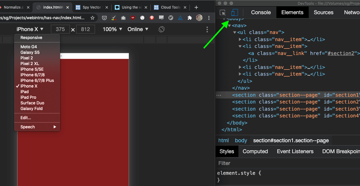
In the dropdown where you had previously set the viewport to be 'iPhone X', change the value to 'Responsive'. Now resize the browser to different viewport widths and see how your page changes to suit the screen size.
Now that we know how make our content work for all viewports, let's dive into CSS layouts!

Normal flow
By default, HTML renders in the browser in the same order that the content is written in the HTML file itself. The first step to a good layout is writing good, semantic HTML!
Default display properties
The next step to understanding our layout is looking back to Week 2, when we discussed inline and block elements Opens in a new window.
Inline elements
Recall that inline elements "flow" with the text around them. This is the basic state of HTML - everything's an inline element until it's declared otherwise.
Block elements
Block elements get their own horizontal space. If there is text (or another type of inline element) before it, the block gets "wrapped" onto a new line. If there is text (or another type of inline element) after it, the text gets "wrapped" onto a new line.
The following elements are defined as block elements in all major browsers' user-agent stylesheet (a.k.a. the default styles):
/* User-agent styles say: */
html, body, div, p, h1, h2, h3, h4, h5, h6,
ul, ol, address, blockquote, dd, dl, dt,
fieldset, form, hr, pre, header, nav,
section, article, aside, footer, figure,
figcaption, details, summary {
    display: block;
}
Inline-block elements
There's a hybrid display property called inline-block. Inline-block elements "flow" with text like inline elements, but get some of the spacing properties of block elements. We'll talk more about it in the box-model section. For now, I just wanted to mention that there are four HTML elements that have a default display property of inline-block:
/* User-agent styles say: */
button, textarea, input, select {
    display: inline-block;
}Defining display properties in CSS
As with all user-agent styles, it's easy to override them in our CSS!
/* This would be a mess, but there's no reason
you can't do it! */
div {
    display: inline;
}
span {
    display: inline-block;
}
em {
    display: block;
}
The CSS box-model

So far, everything we've talked about just deals with whether or not an element gets displayed in line with text, or it gets its own horizontal space. Once we start talking about elements' height, width, and adding space inside or around things, we're talking about the CSS box-model!
Border-box
There's a CSS declaration that is going to make your life easier. Put this at the beginning of any CSS you write where you're dealing with layout.
html {
  box-sizing: border-box;
}
*, *:before, *:after {
  box-sizing: inherit;
}
There's a great explanation for why we're using this at CSS Tricks Opens in a new window.
Long story short, however: if you don't add this to your CSS, the height & width you set on your elements will not include the size of your padding or borders, which will get confusing.
Height & Width
The height and width CSS properties are values you can set on block and inline-block elements. You can use any of our CSS units to define them.
Inline elements don't care what height or width you set!
Padding
padding is a CSS property that defines the space inside of the element's "box".
You can write it short-hand:
.my-element {
/* will have 2rem of padding on the
top, right, bottom, and left */
    padding: 2rem;
}
.my-other-element {
/* will have 2rem of padding on the top,
1rem on the right, 1rem on the bottom,
and 2rem on the left */
    padding: 2rem 1rem 1rem 2rem;
}
Or you can define the properties one-by-one:
.my-other-element {
    padding-top: 2rem;
    padding-right: 1rem;
    padding-bottom: 1rem;
    padding-left: 2rem;
}
You can write them in any order, and you can leave some out if you don't need to define them.
Margin
Margin is very similar to the padding property, except that it is the space outside the box, and is not used to calculate the height and width of the element.
Role of the display property in the box-model
display: block- Doesn't share horizontal space;
- Cares about height & width;
- Cares about padding & margin;
display: inline-block- "Flows" in-line with text;
- Cares about height & width;
- Cares about padding & margin;
display: inline- "Flows" in-line with text;
- Doesn't care about height & width;
- Cares about about vertical padding & margin but this doesn't affect the layout of elements around it;
- Does care about horizontal padding & margin (and this does affect the layout of elements around it;
Border
border, as you might guess, is the border at the edge of the element's box.
It's written using the follow properties: width, style and colour.
.my-bordered-element {
    border: 2px solid red;
}
Check out this demo I made for us!

Positioning
Everything in HTML is a box. By default, all of these boxes get stacked together in a row in the order that they appear in the HTML document, until they have to wrap around and start a new row. Block elements get their own row, but otherwise everything follows this principle.
We can change these rules by applying the CSS position property. There are five values we can give to this property in our CSS.
Static
This is the default value for everything. position: static just means that this element respects the flow of the document. You can't give a static element top, bottom, left, right, or z-index properties (which we'll talk about in a moment).
Relative
Giving an element position: relative is similar to position: static, except that we can start to use the properties top, bottom, left and right.
These positioning properties define where an element sits relative to where it would be normally.
Absolute
Giving an element position: absolute is similar to position: relative, except that now we're defining the element's position relative to the document, instead of the element's parent.
Fixed
position: fixed doesn't care about your document. It's staying exactly where it is relative to the window. Even if you try to scroll away, it is staying in the same spot.
See the Pen Positioning demo by Simon Borer (@simonborer) on CodePen.
Sticky
There's also position: sticky, which is really fun, but I'm gonna make a judgement call and say that it's a little too complicated to dig into today. It's a nice thing to have, and you can read more about it on your own Opens in a new window, but isn't actually that important for making a solid, functional layout.

Z-index
The z-index property is pretty simple - it defines what goes on top of what when elements overlap. Normally, it's whatever comes later in the HTML, but that can be overridden by setting this CSS property.

Floats
Okay, remember when I was telling you about the bad old days when all webpages were laid out with tables?
When I started out as a front-end dev, that era had largely ended, but we were in the midst of laying out everything with floats.
It sucked.
The good news is that floats are really good at what they were designed to do.
The CSS float property is intended to make text (and other "inline" stuff) flow around the floated element, like an image in a newspaper.
See the Pen Float demo by Simon Borer (@simonborer) on CodePen.
You can float things left, or right, or "none" (which is the default). But if you're tempted to use it for anything more than wrapping images around text, well... I suggest you wait until you've used flexbox (the subject of our next lesson).
Lab
Are you in the Monday class? Great! Lab 4 is this: Send me a screenshot of you getting as far as you can in the game Flexbox Froggy Opens in a new window. Make sure you include your computer's desktop showing the time of completion in your screenshot.
You're also getting your First Assignment Opens in a new window this week!