Layout Part 2: Responsive workflow
Today we'll build a responsive web page using flexbox.
Hi! Are you in the Monday class? Then don't worry about it! This is a lesson just for the Thursday people, because they have less holidays than you :)
Let's try something a little different today!
I'll walk you through how I take a design from mockup to responsive.
Images courtesy of absurd.design Opens in a new window, words by Wes Anderson.
Today we look at the process that goes into building out a mobile-first, responsive web page.
After the walk-through, you'll be asked to build a page with the following "MVP" requirements:
- Code should be semantic and validate.
- On larger screens, the content of the page should not take up the full width of the viewport, but instead occupy a centred column.
- Interactive elements (such as buttons and links) should give the user feedback when the state changes.
- Content should include a distinct header, footer and main, with images and text.
- At least one section should have multiple columns that at side-by-each on desktop and "stacked" into a single column on mobile.
The following are considered "nice-to-haves":
- The page should have some style, such as a consistent color palette (you can generate one Opens in a new window if you like).
- Load Normalize via CDN.
- Images should be loaded from a local folder.
- In at least one instance, the flex order should change based on a media query.
- Paragraph text should not exceed 60 characters in width.
Rows and columns courtesy of flexbox
See the Pen ExNLxzP by Simon Borer (@simonborer) on CodePen.
Stage one: starting from scratch
We'll start with what you'll recognize as our "bare minimum" html document, plus the viewport meta tag, the box-sizing CSS, and our normalize stylesheet delivered via CDN.
What's a CDN?
A CDN, or "Content Delivery Network", is a service that keeps copies of files all over the world. When a browser makes a request for a file (i.e. when they load your website), the CDN is supposed to deliver the copy that will get to them fastest. This is a very common technique (though not without detractors Opens in a new window).
You can pay for a CDN to host your own assets, like your images, but you can also use a CDN to deliver popular open-source code, like Normalize.
index.html<!DOCTYPE html>
<html lang='en'>
<head>
<meta charset='utf-8'>
<meta name='viewport' content='width=device-width, initial-scale=1'>
<link rel="stylesheet" href="https://cdnjs.cloudflare.com/ajax/libs/normalize/8.0.1/normalize.min.css">
<link rel="stylesheet" href="style.css">
<title>A page about Bottle Rocket</title>
</head>
<body>
Bottle Rocket
</body>
</html>style.csshtml {
box-sizing: border-box;
}
*,
*:before,
*:after {
box-sizing: inherit;
}Stage two: Add the content, and make it semantic
The next stage should look pretty familiar to you, except that there are some div tags grouping together some of the content.
These will eventually become our rows and columns. Think of them as layout blocks.
<img src="images/lightbulb.png" alt="Lightbulb">index.html (content in the body)<header>
<nav>
<ul>
<li><a href="#">Home</a></li>
<li><a href="#">Away</a></li>
<li><a href="#">Info</a></li>
</ul>
</nav>
<div>
<div>
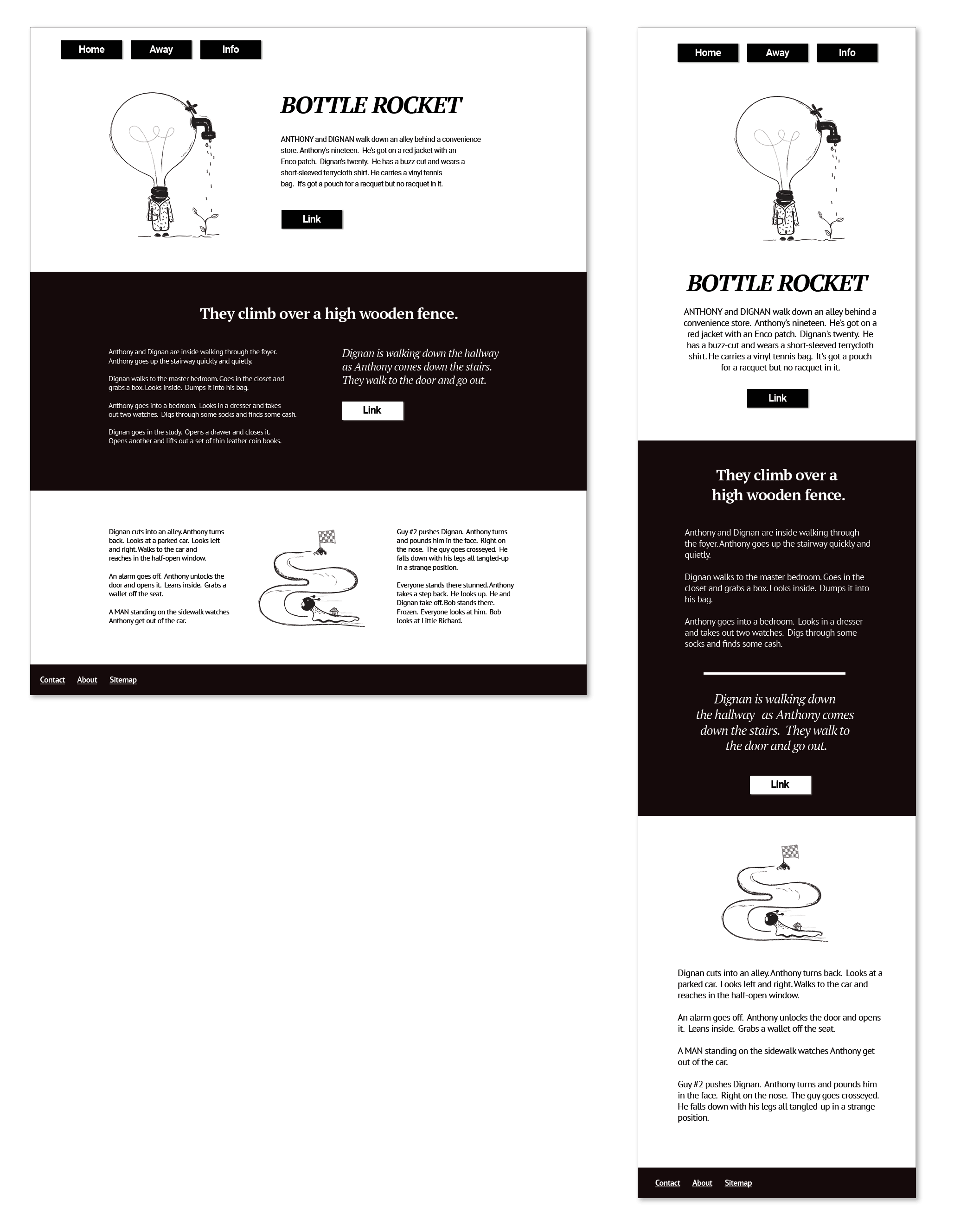
<img src="images/lightbulb.png" alt="An embodied lightbulb with a spigot watering a plant (it's an absurd illustration).">
</div>
<div>
<h1>Bottle Rocket</h1>
<p>ANTHONY and DIGNAN walk down an alley behind a convenience store. Anthony's nineteen. He's got on a red jacket with an Enco patch. Dignan's twenty. He has a buzz-cut and wears a short-sleeved terrycloth shirt. He carries a vinyl tennis bag. It's got a pouch for a racquet but no racquet in it.</p>
<a href="#">Link</a>
</div>
</div>
</header>
<main>
<section>
<div>
<h2>They climb over a high wooden fence.</h2>
<div>
<div>
<p>Anthony and Dignan are inside walking through the foyer. Anthony goes up the stairway quickly and quietly.</p>
<p>Dignan walks to the master bedroom. Goes in the closet and grabs a box. Looks inside. Dumps it into his bag.</p>
<p>Anthony goes into a bedroom. Looks in a dresser and takes out two watches. Digs through some socks and finds some cash.</p>
<p>Dignan goes in the study. Opens a drawer and closes it. Opens another and lifts out a set of thin leather coin books.</p>
<hr>
</div>
<div>
<div>Dignan is walking down the hallway as Anthony comes down the stairs. They walk to the door and go out.</div>
<a href="#">Link</a>
</div>
</div>
</div>
</section>
<section>
<div>
<p>Dignan cuts into an alley. Anthony turns back. Looks at a parked car. Looks left and right. Walks to the car and reaches in the half-open window.</p>
<p>An alarm goes off. Anthony unlocks the door and opens it. Leans inside. Grabs a wallet off the seat.</p>
<p>A MAN standing on the sidewalk watches Anthony get out of the car.</p>
</div>
<div>
<img src="images/race.png" alt="A snail wearing a racing helmet approaching the end of a race.">
</div>
<div>
<p>Guy #2 pushes Dignan. Anthony turns and pounds him in the face. Right on the nose. The guy goes crosseyed. He falls down with his legs all tangled-up in a strange position.</p>
<p>Everyone stands there stunned. Anthony takes a step back. He looks up. He and Dignan take off. Bob stands there. Frozen. Everyone looks at him. Bob looks at Little Richard.</p>
</div>
</section>
</main>
<footer>
<nav>
<ul>
<li><a href="#">Contact</a></li>
<li><a href="#">About</a></li>
<li><a href="#">Sitemap</a></li>
</ul>
</nav>
</footer>Stage 3: Style the elements
Next we've got some pretty sensible styles to take our content to "square one" for our design.
style.css/*
Only style elements when you know
for certain that these rules should
always apply.
*/
img {
/* Never allow images to be bigger
than their parent */
max-width: 100%;
}
nav ul {
/* Nav lists don't need dots */
list-style: none;
display: flex;
padding: 0;
margin: 0;
}
nav li {
margin: 0 .5rem;
}Stage 4: Add components
Now we add styles for any design patterns that are going to repeat.
style.css/*
A component is a discrete design pattern.
A button is a great example.
*/
.button {
color: white;
background: black;
padding: .5rem 2rem;
margin: 2rem auto 0;
display: inline-block;
text-decoration: none;
box-shadow: 2px 2px 2px #c4c4c4;
/* This property maintains the
width of an inline element when
the parent container is
display: flex */
align-self: flex-start;
}
.button:hover {
text-decoration: underline;
box-shadow: 3px 3px 2px #d3d3d3;
}
/*
The :active pseudoclass applies when
the element has been engaged. In this
case, it is when the anchor is being
clicked on.
*/
.button:active {
box-shadow: 1px 1px 1px #c4c4c4;
}index.html<!--
We'll give any links that should look like buttons
the class "button"
-->
<a href="#" class="button">Link</a>Stage 5: Layout
In the next step, we add the css that will determine the layout (rows and columns) for our page. We create the default layout, which works on mobile, and then add any adjustments for larger screens.
style.css/* Layout */
.content {
/* The 'auto' property for margins, applied
horizontally, will center a block element */
max-width: 80rem;
margin-left: auto;
margin-right: auto;
}
.columns {
/* Columns will be 'stacked' and
centred on mobile */
display: flex;
flex-direction: column;
justify-content: center;
}
.column {
display: flex;
flex-direction: column;
justify-content: center;
}
/* Media queries */
@media (min-width: 48rem) {
/* Columns will be side-by-each on desktop */
.columns {
flex-direction: row;
}
.column {
justify-content: flex-start;
}
/* On desktop, the columns in the header
are not even width, so we'll define their
widths here. */
.header .column-one {
flex-basis: 40%;
}
.header .column-two {
flex-basis: 60%;
}
}index.html (simplified)<header class="header">
<nav class="content">
<ul>
<li><a class="button" href="#">Home</a></li>
<li><a class="button" href="#">Away</a></li>
<li><a class="button" href="#">Info</a></li>
</ul>
</nav>
<div class="content columns">
<div class="column column-one">
<img src="images/lightbulb.png" alt="An embodied lightbulb with a spigot watering a plant (it's an absurd illustration).">
</div>
<div class="column column-two">
<h1>Bottle Rocket</h1>
<a href="#" class="button">Link</a>
</div>
</div>
</header>
<main>
<section>
<div class="content">
<h2>They climb over a high wooden fence.</h2>
<div class="columns">
<div class="column">
<p>Anthony and Dignan are inside walking through the foyer. Anthony goes up the stairway quickly and quietly.</p>
</div>
<div class="column">
<a href="#" class="button">Link</a>
</div>
</div>
</div>
</section>
<section class="content columns">
<div class="column">
<p>A MAN standing on the sidewalk watches Anthony get out of the car.</p>
</div>
<div class="column">
<img src="images/race.png" alt="A snail wearing a racing helmet approaching the end of a race.">
</div>
<div class="column">
<p>Everyone stands there stunned. Anthony takes a step back. He looks up. He and Dignan take off. Bob stands there. Frozen. Everyone looks at him. Bob looks at Little Richard.</p>
</div>
</section>
</main>Stage 6: Categories of content
Next we add some "helper" classes - styles that can add variations to our default styles.
In this case, we'll add one class to the container that will override our styles with higher specificity.
style.css/* Helpers */
.inverted {
background: black;
color: white;
}
.inverted .button {
background: white;
color: black;
}
.inverted a {
color: white;
}
.inverted .home-rule {
background-color: white;
}index.html<section class="inverted">
<div class="content">
<h2>They climb over a high wooden fence.</h2>
<div class="columns">
<div class="column">
<p>Anthony and Dignan are inside walking through the foyer. Anthony goes up the stairway quickly and quietly.</p>
<p>Dignan goes in the study. Opens a drawer and closes it. Opens another and lifts out a set of thin leather coin books.</p>
<hr class="home-rule">
</div>
<div class="column">
<div>Dignan is walking down the hallway as Anthony comes down the stairs. They walk to the door and go out.</div>
<a href="#" class="button">Link</a>
</div>
</div>
</div>
</section>Stage 7: The order of things
At this point, we add one of our flex properties, which you'll get to learn more about in this week's lab.
Need a preview? Here's a little demo:
style.css.columns--three-col .image {
order: -1;
}
@media (min-width: 48rem) {
.columns--three-col .image {
order: 0;
}
}index.html<section class="content columns columns--three-col">
<div class="column">
<p>Dignan cuts into an alley. Anthony turns back. Looks at a parked car. Looks left and right. Walks to the car and reaches in the half-open window.</p>
<p>An alarm goes off. Anthony unlocks the door and opens it. Leans inside. Grabs a wallet off the seat.</p>
<p>A MAN standing on the sidewalk watches Anthony get out of the car.</p>
</div>
<div class="column image">
<img src="images/race.png" alt="A snail wearing a racing helmet approaching the end of a race.">
</div>
<div class="column">
<p>Guy #2 pushes Dignan. Anthony turns and pounds him in the face. Right on the nose. The guy goes crosseyed. He falls down with his legs all tangled-up in a strange position.</p>
<p>Everyone stands there stunned. Anthony takes a step back. He looks up. He and Dignan take off. Bob stands there. Frozen. Everyone looks at him. Bob looks at Little Richard.</p>
</div>
</section>Stage 8: Visibility & Size
Let's bring our header image down to a reasonable size, keep our blocks of text readable and create a helper class to only show certain content on smaller screens.
style.css.header__image {
margin: 0 auto;
max-height: 22rem;
}
@media (min-width: 48rem) {
.mobile-only {
display: none;
}
.text-block {
max-width: 55ch;
}
.columns--three-col .column {
flex-basis: 37ch;
}
}index.html<img class="header__image" src="images/lightbulb.png" alt="An embodied lightbulb with a spigot watering a plant (it's an absurd illustration).">
...
<p class="text-block">ANTHONY and DIGNAN walk down an alley behind a convenience store. Anthony's nineteen. He's got on a red jacket with an Enco patch. Dignan's twenty. He has a buzz-cut and wears a short-sleeved terrycloth shirt. He carries a vinyl tennis bag. It's got a pouch for a racquet but no racquet in it.</p>
...
<div class="column text-block">
<p>Anthony and Dignan are inside walking through the foyer. Anthony goes up the stairway quickly and quietly.</p>
<p>Dignan walks to the master bedroom. Goes in the closet and grabs a box. Looks inside. Dumps it into his bag.</p>
<p>Anthony goes into a bedroom. Looks in a dresser and takes out two watches. Digs through some socks and finds some cash.</p>
<p>Dignan goes in the study. Opens a drawer and closes it. Opens another and lifts out a set of thin leather coin books.</p>
<hr class="home-rule mobile-only">
</div>Stage 9: Padding & Margins
Personally, I find this part really satisfying - these are all the tweaks we make so that everything has room to "breathe".
There's a degree of subjectivity here - ideally you would have a system that determines padding and margins based on consistent rules for types of content. But what looks "right" to different people can vary greatly. Information density in web design can be influenced by language Opens in a new window, for example.
Since this page is a "one-off", though, we'll let our eyes guide us, rather than trying to develop a whole design system.
/*
    Room on the sides of our columns
*/
.column {
    padding: 0 2rem;
}
/* A generic helper class for space
at the top and bottom */
.padding-vertical {
    padding-top: 3rem;
    padding-bottom: 3rem;
}
.nav-list--header {
    margin-top: 1rem;
}
.columns--three-col .image {
    margin-bottom: 2rem;
}
.header__heading {
    margin-bottom: .5rem;
}
/* Centre the header image */
.header__image {
    margin: 0 auto;
    padding: 0 0 1rem;
}
.main__heading {
    margin-bottom: 2rem;
    margin-left: auto;
    margin-right: auto;
}
.emphasis {
    margin: 1rem 0;
}
.nav-list a {
    display: inline-block;
    padding: 1rem;
}
@media (min-width: 48rem) {
    .button {
        margin-top: 1rem;
        margin-left: 0;
        margin-right: 0;
    }
}index.html<header class="header">
<nav class="content">
<ul class="nav-list nav-list--header">
<li><a href="#" class="button">Home</a></li>
<li><a href="#" class="button">Away</a></li>
<li><a href="#" class="button">Info</a></li>
</ul>
</nav>
<div class="content columns padding-vertical">
<div class="column column-one">
<img class="header__image" src="images/lightbulb.png" alt="An embodied lightbulb with a spigot watering a plant (it's an absurd illustration).">
</div>
<div class="column column-two">
<h1 class="header__heading">Bottle Rocket</h1>
...
</div>
</div>
</header>
...
<h2 class="main__heading">They climb over a high wooden fence.</h2>
...
<ul class="nav-list">
<li><a href="#">Contact</a></li>
<li><a href="#">About</a></li>
<li><a href="#">Sitemap</a></li>
</ul>Stage 10: Text Styles & Alignment
Here we add our finishing touches - font styles and alignments.
body {
    font-family: sans-serif;
    line-height: 1.5;
}
.heading {
    font-family: serif;
    text-align: center;
}
.nav-list--header {
    justify-content: center;
}
.main__heading {
    font-size: 2rem;
    max-width: 60%;
}
.emphasis {
    font-size: 1.5rem;
    font-style: italic;
    font-family: serif;
    line-height: 1.4;
    text-align: center;
}
@media (min-width: 48rem) {
    .column.image {
        display: flex;
        justify-content: center;
    }
    .header__heading {
        text-align: left;
        font-size: 3rem;
    }
    .header__summary {
        text-align: left;
    }
    .nav-list--header {
        justify-content: flex-start;
    }
    .emphasis {
        text-align: left;
    }
}index.html<h1 class="heading header__heading">Bottle Rocket</h1>
<p class="text-block header__summary">ANTHONY and DIGNAN walk down an alley behind a convenience store. Anthony's nineteen. He's got on a red jacket with an Enco patch. Dignan's twenty. He has a buzz-cut and wears a short-sleeved terrycloth shirt. He carries a vinyl tennis bag. It's got a pouch for a racquet but no racquet in it.</p>
...
<h2 class="heading main__heading">They climb over a high wooden fence.</h2>