Optimization
Whether you're driven by ethics or the almighty dollar, great web performance is a must. Today we'll start learning how to deliver high-performance web applications.

Why optimize?
A website can be a lot of work. Why should we worry about making it "optimal", when it can just be "done"?
Well, it turns out, if you're not making the time to prioritize your website's performance, it could have consequences for the planet, social disparities, and whether or not anyone uses your website in the first place!
It's kind of nice that, more often than not, web optimization is one of those golden opportunities where what is "green", what is good, and what is profitable overlap.
That doesn't mean you won't have to fight for it sometimes - people tend to think of web optimization as one of those things that is responsible but boring, whereas weighing your site down with a bunch of videos, widgets, carousels Opens in a new window, and other junk "looks neat" (even if the users hate it).

The web's carbon footprint
A couple years ago, Mozilla reported that the internet was producing more carbon emissions than the airline industry Opens in a new window.
I'm personally of the opinion that any solution that begins with, "If everybody would just..." is no solution at all.
That's why it's important to keep pressure on big companies to do things like wiping out their carbon footprint Opens in a new window, but I also think it's important to consider the impact you might have if you end up working for (or starting!) a larger company that serves billions of megabytes to millions of people.
While it would be very cool if everyone's websites were solar powered Opens in a new window, the simplest and most accessible way to reduce your website's carbon footprint is by making it smaller.
When I say "smaller", I don't mean a smaller font-size, or even less content, I mean in terms of "page weight" - smaller file sizes for your code and assets.

Democratizing through performance
In low- and middle-income countries, every 10% increase in broadband internet access increases both GDP and overall employment by about 1.4% Opens in a new window.

It's not the cabling that makes the difference - it's the access. A few years back, the Youtube team set a "performance budget" (a maximum page weight), squeezed every ounce of savings from their code and launched - only to find their average loading times had skyrocketed!
When they looked at the analytics, they realized that millions of people in places with poor internet connectivity had suddenly gained the ability to watch Youtube. Prior to optimization, the videos would simply "time out" because the site was too slow.

Making your site accessible to people with slow internet connections, underpowered devices, or sketchy mobile networks means granting access to potentially millions of people. Depending on what your site is and does, this could mean granting economic and learning opportunities that weren't there before, or it could just mean a good customer experience.
Search Engine Optimization
What is SEO?
SEO is a set of best practices for making sure that your site shows up high in the search results when someone is looking for the content or services that you're offering.
Factors in SEO
Search engines keep their precise algorithms secret in order to discourage "dark patterns" - people trying to game the system.
That being said, the search engine companies are open about what factors they take into consideration when deciding what the best search results are.
We've already talked about how to achieve some of the most important metrics - we've looked at how to make our site semantic, accessible, mobile-friendly and responsive, and how to curate content that capitalizes on search trends.
Next week, we'll discuss two other factors: how to secure your site and deliver your site over HTTPS using an SSL certificate, and how to organize your URL structure in an SEO-friendly way.
There are three other significant factors in SEO:
- the number of organic (non-sketchy) links to your pages,
- a sitemap (learn how to generate a sitemap Opens in a new window), and
- performance.
For the next two weeks, we'll be focussed on performance, which Google has said Opens in a new window is a major factor in their search rankings.
SEO checklist
- Code is semantic
- Interface is accessible
- Site is responsive
- URL structure is well organized
- Content is targeted
- Connection is secure
- Generate a sitemap
- Incoming links
- Performance is optimized
Why isn't incoming links checked? Because it's not something you can affect when making your site - only promoting it.
SEO myths
While we're here, let's talk about a few things that people will tell you are important for SEO, but actually aren't!

Dev tools performance metrics
Our browser dev tools can give us powerful insights into our site's performance.
If you really want to nerd out, you can click on the "Performance" tab, and hit the reload button to record and analyze the minute details of a page's load.
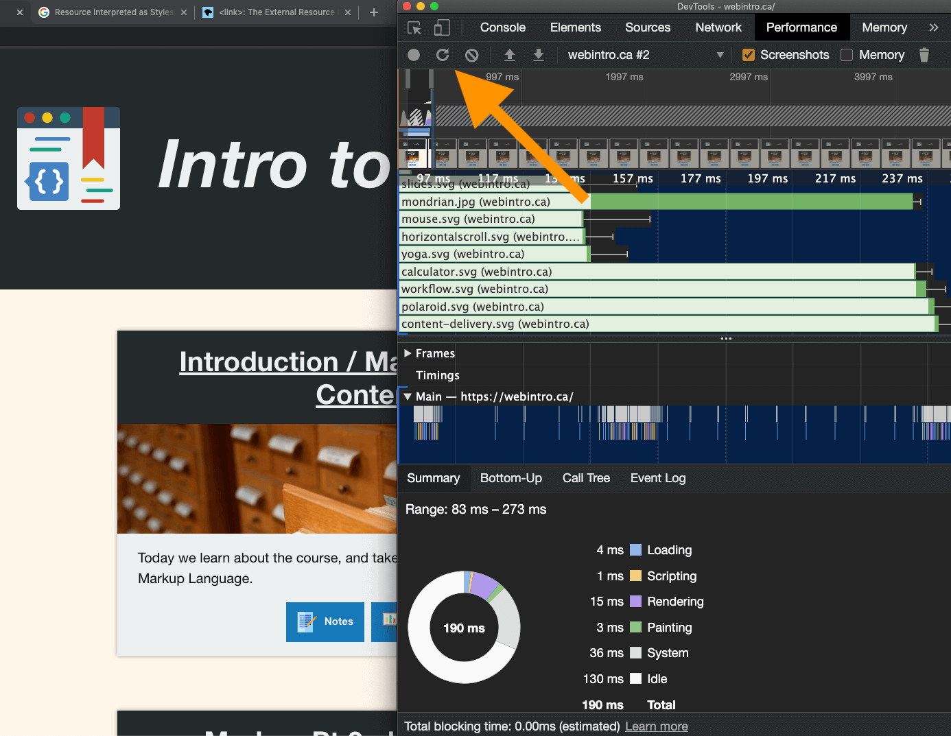
We're not going to dig into the performance tab right now. Instead, open up Chrome and open the Dev Tools, and then select "Lighthouse" from the top bar (you might need to click the » at the end of the toolbar if your window is small).
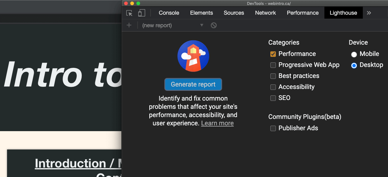
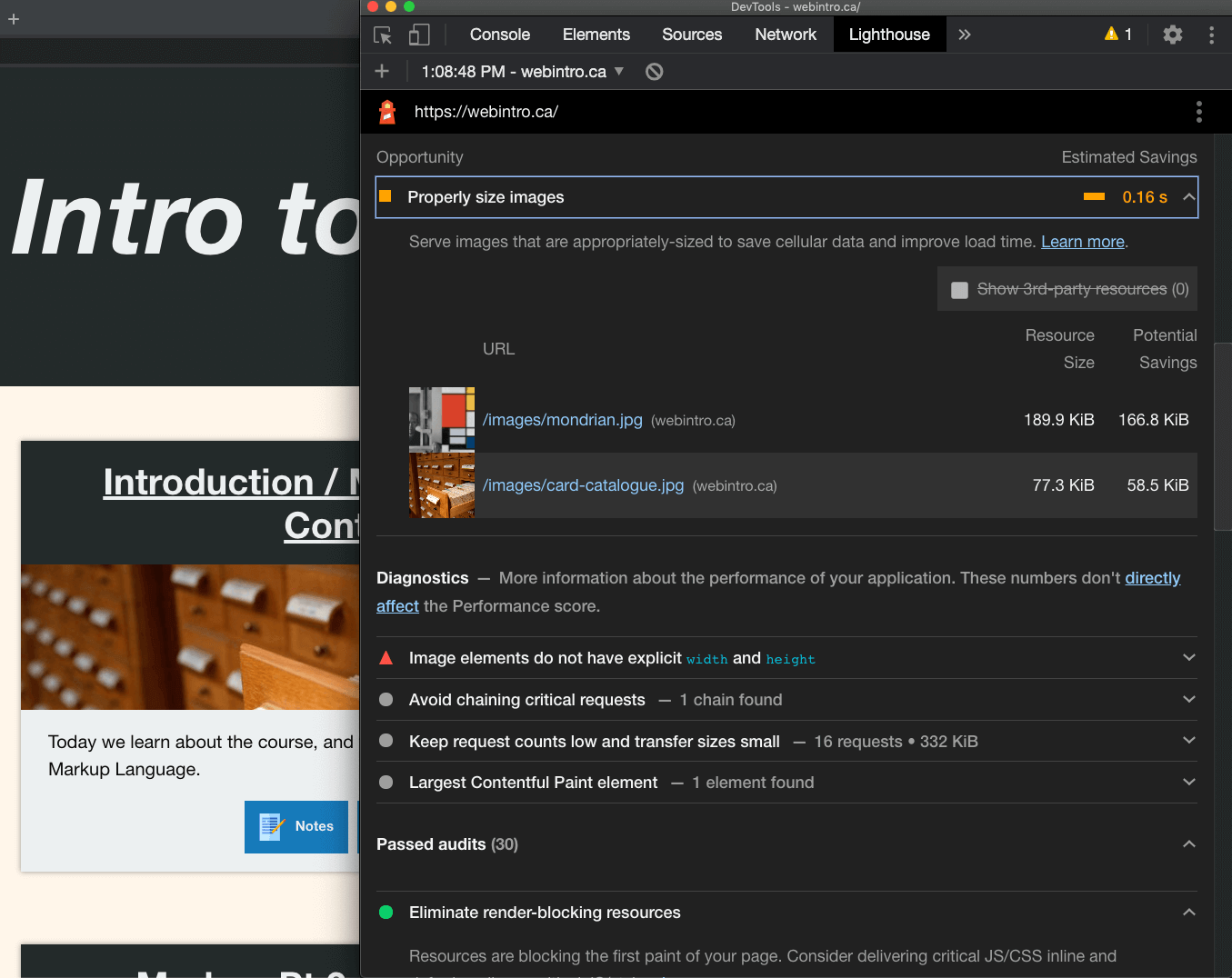
Lighthouse gives the page a score, and details about what opportunities there are for improvement, what kind of impact those improvements might have, and what's being done right!

These metrics make money
Milliseconds sound small, don't they? Well, they can translate into millions of dollars. Show these facts & figures to your team when they question why you're trying to shave 50ms off the page load time.
Amazon (PowerPoint, slide #15): 100 ms of latency resulted in 1% less sales.
Google (video): 500 ms caused a 20% drop in traffic.
Walmart (slide #46): a 100 ms improvement brought up to 1% incremental revenue.
Mozilla: Shaving 2.2 seconds off page load time increased downloads by 15.4%.
Yahoo: 400 ms resulted in a 5 to 9% drop in traffic.

Image types
For the typical website, images are probably the asset that takes up the most bandwidth. Therefore, the choices you make with your images could make or break your performance.

Images come in different formats. You've probably already noticed that image files can have different file extensions. Each format has some things they're good at, and some things they're not so good at. It depends what it's an image of, and what you want to use it for!
Use case: photography
Everybody loves rich, full-colour photographic images.
This is where the JPEG format shines. It uses "lossy compression" to deliver reasonably lightweight images that look good (even if some amount of detail is lost).
Images in JPEG format are saved with the file extension .jpg.
Alternatively, there is a new images format that does well with photographic detail at an even small size. This image format is called WEBP. The drawbacks of webp are that it isn't supported in older browsers, or by most image-viewing software outside the browser, and converting to webp can be challenging.
Use case: detail (and bonus, opacity!)

Want a lossless image format to preserve detail, like fine text, or a detailed screenshot? (Not that you would put relevant text content in an image! But we'll get to that later.)
You want the Portable Network Graphics format.
Bonus feature: opacity
Want parts of your image to be partially or entirely see-through?
Use case: simple colors

I love SVG. They are tiny - this elephant image is 1/100th the size of the JPEG example (3kb vs 305kb before compression).
SVGs are great anytime you need simple shapes and colours. They have a ton of cool features - you can create animations with them Opens in a new window and change them programmatically using CSS and/or javascript, they never pixellate so they're great for responsiveness, and they're actually made of markup code, just like HTML!
Obviously, they aren't capable of photo-realism, but they are great at what they do.
Runners-up:
GIFs and PNG (when they're in 8-bit format) are also good choices for limited colours - they both come in small sizes when they only use 256 colours.
Use case: animation

And now for the old debate - is it pronounced "gif", or "gif"?
I hate to be the one to break it to you, but all your favourite gifs aren't gifs at all. They're videos. Look at the above file sizes (and compare the qualities) to see why.
Twitter, Pinterest, Imgur, even /r/highQualityGifs, they all deliver video in place of gifs.
And how do we put a video on our page?

Image Optimization
Image optimization isn't as fancy as it sounds. It just means using images that aren't bigger than the size at which anyone will see them, and using the right amount of compression - not too much, not too little.
The right image size
To resize images, you'll need image editing software.
You should be able to use the Adobe Suite via Humber's appsteam service Opens in a new window. Otherwise, GIMP Opens in a new window is a free, open-source alternative.
But the functionality we need is pretty simple compared to what those photo editing suites offer. If you don't already have a photo editor you like installed on your computer, Adobe has a free online editor called Photoshop Express Opens in a new window that does everything we need for our purposes, including resizing images and compressing them.
So consider the largest your image will need to be - if you're going to use it to fill the width of your main column, and your main column is 960px wide, your image should be 960px in width!
Further reading
Want to serve different images based on viewport width or pixel density (i.e. retina devices)? That's a great idea, and totally possible thanks to the<picture> element Opens in a new window. However, it's a deep-dive that we don't have time for today. If you want to know more, I highly recommend Jason Grigsby's Responsive Images 1010 Opens in a new windowThe amount of compression
Balancing image resolution with file size isn't an exact science. For one thing, it depends on the image!
If it's a well-lit photograph of primary-coloured blocks, that's going to compress really nicely. Gradients, on the other hand, don't tend to fare so well, as they're the first thing you notice once the number of colours starts to drop from many millions to hundreds of thousands to hundreds.






Notice that there is a huge saving on the file size between Level 100 and Level 80, with diminishing returns the further down you go. Judge for yourself when you start caring about the loss in image quality. For me it's > Level 30, but < Level 80.
Going further
You can actually get a lot more savings with tools beyond just exporting from your image editor, but most of these tools are command-line based and/or should be built into your development workflow.

That being said, I've struggled to get better results than those offered by a free, drag-and-drop website called TinyPNG Opens in a new window, which, despite the name, works for both PNG and JPEG formats.
It does a really remarkable job, and I use it often for small projects!

Background images
Remember how I mentioned earlier that you would never put relevant text content in an image?
There's a good reason for that! Computers suck at reading text embedded in images, and Google doesn't try. If your text content matters, it shouldn't be hidden away in an image, or an alt attribute. That would be very bad for both accessibility and SEO.
But what if I want text on top of an image??
If you're going to overlay text on an image that conveys information, you're going to have to use the CSS positioning & layering techniques we talked about in week 5 in order to move your text on top of your image.
However, if your image conveys no information, then we can use the CSS property background-image. The reason I make this distinction is because background images are not accessible - you can't put an alt attribute on them to supply a text alternative.
CSS background properties
You're already familiar with the CSS "background" property, but there are several more properties that affect the background of a block element.
.my-class {
    background: blue;
    background-image: url('/images/my-image.jpg');
}
The "background-image" property accepts a url pointing to a an image file. Notice that the file path is wrapped in the url() function - it won't work without that.
Luckily, if you forgot it, or if the link to the image was broken, or if the image was in a format that the browser didn't support, the elements with your class would still get the background color you defined.
One of the very cool things about CSS is that if you have an invalid or unsupported property, it doesn't throw an error - it just ignores it and moves on to the next thing. This means it's really easy to create fallbacks like this!
Go ahead, use that fancy new property that only works in one browser - when it doesn't work, you've got a backup declared.
This is also known as "progressive enhancement" - letting cool new features fail silently in places that they aren't supported, with reliable backups in place.
You can also set the background-size, background-position, and background-repeat properties.
Use these for all your poetry backdrops!
January embers
My heart burns there, too.
Exercise time!
Okay, I know the exercises are ungraded, but I strongly suggest that everyone completes this, because next week's lab will build off of this. In other words, do this now otherwise you'll need to do it all next week.
- If you haven't already, sign up for a free github account Opens in a new window.
- Use your github to sign up for a free Netlify account Opens in a new window.
- Put together the copy deck & image assets for a simple three page website. This can be anything you like, and doesn't require in-page navigation, multiple sections, or any of the other requirements from previous assignments. That being said, if you want to re-use code you wrote before, go for it!
Note: you don't have to code anything this week, but you will next week, because we're gonna put these pages online, so let me repeat: keep it simple. - For your copy deck, plaintext, rtf, Word or Google Docs are all acceptable formats.
- The copy deck should not only include the literal text of your pages, but also note what content will be headings, what content will be linked, and any other UI elements that may be on your page.
- These pages will need to link to one another, so you can get to any of the other two pages from any of the three pages.
- On at least one page, give your content a good reason to have a JPEG image.
- On at least one page, give your content a good reason to have a PNG image.
- On at least one page, give your content a good reason to have a background image.
Your deliverables for this lab: a zipped folder with 1) your copy deck and 2) image assets.